|
 |
|||||||||||||
Presidential Personas
|
||||||||||||||

 |
 |
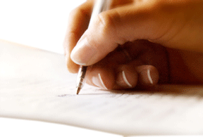
Okay, maybe that last question wasn’t fair. We choose candidates based on political platform, not personality, right? Or do we? Despite all the propaganda and punditry, Americans often complain they don’t really know the candidates until it’s too late. That’s why campaigns turn personal. That’s where handwriting analysis can help.
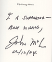
So how did you score? If you pegged the first writer as passionate, strong and direct, you won’t be surprised to learn it’s John McCain. The second, more reasoned, finessed and patient writer is Barack Obama. You probably guessed by the weight, size and shape of their strokes: heavy, large and rigid versus light, small and flexible. Like his Straight-talk Express, McCain’s writing is candid and prescriptive. Obama’s writing invites the reader to discourse.
Public Images
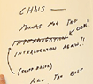
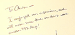
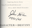
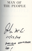
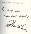
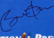
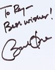
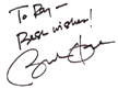
Despite their differences, though, these two share a common interest in public image, which is conveyed in signatures. Look at their signed notes.
Each writes his first name larger than his last. That’s like saying, Call me John/Barack — and don’t confuse me with my namesake father!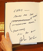
Each signs in the center of the page with big initials, indicating both want to be the center of attention and make a big impression. But Obama’s initials are inflated beyond all imagining, even sheltering some of his name. He has a huge self-image, narcissistic even, and projects an image that is larger than life — yet he is protecting his personal anonymity. McCain has ego, but not of the same magnitude, and he is fully exposed.
What you see in signatures, however, is not always what you get in their texts. In both men, public persona and private reality are mismatched. McCain is a block printer, the most private of writers, yet he signs with cursive because it implies conventionality and sociability. Likewise, Obama’s signature differs from his text in size and clarity.
Ambiguity obscures both signatures and individual letters within each text, lending privacy to the signatures and loopholes to the messages. If you can’t read what he wrote, you can’t hold him to it. It’s politics as usual, but at least the letters are legible within context, so neither man is totally evasive.
Finally, both candidates demonstrate a weakness with a consistently curious formation. Can you spot them?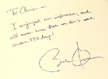
Obama’s bisected O crosses out his family name. Graphologists debate whether this reflects anger at his absentee father or the duality of his biracial heritage. Either way, it is a serious sign of self-negation that has the further effect of forming numerous intersecting lines where they don’t belong. These “inappropriate x’s” can reflect mourning, concern or even malice regarding one’s own health or that of another — in this case, someone who shares his last name. How ironic that McCain, who stared down death and won, has no inappropriate x’s in his signature.
He has instead a tremendous gap between the o and h of John, followed by weak and shaky writing at the summit of the h. It’s reminiscent of the victory salute he gives at the end of each speech, with his wife’s help, because he is too weak to lift his own arms that high. The tremendous lead-in to the h is his running start that sweeps the pen upward.
Why does he persist in pushing his physical limit if it’s that hard? Some letters have particular associations to a specific aspect of one’s character. The letter h illustrates one’s philosophies. McCain is telling us with his lofty h that he has lofty ideals. Furthermore, his philosophies are fixed, because his h loop is very narrow, almost obliterating any ideas outside his own world view. The pointiness of that letter is akin to a weapon, meaning he will attack when threatened. At other times it looks like a pup tent, which is a sure sign of stubbornness.
McCain’s physical weakness likely accounts for his choice of printing over cursive, as well. Composed entirely of downstrokes, printing is easier to execute but less evocative.
Printers are as a group considered pragmatists with high self-regard, good social skills and a wry sense of humor. The printer who chooses capital block letters, unless for professional reasons, chooses the most anonymous form of communication.
 |
 |
 |
 |
No one signs precisely the same twice, but their hallmarks remain constant. |
|||
 |
 |
 |
 |
Private Realities
Even in their messages, their private realities, the opposing candidates share some common ground. Their writings lean forward with an eye to the future. Their penchant for beginning letters at the top, rather than leading in from the base, shows how they get right to the point. And their tightly closed o’s that resemble tightly shut mouths show them to be discreet.
But for all the talk of McCain’s independence, it is Obama’s d’s that show him to fit this stereotype. Socialization is expressed in d, and unusually short and wide d’s are common to those who play by their own rules.
In other samples, though, McCain demonstrates the same mindset with his disregard for capitalization rules. And the wide spacing between his words shows a pervasive feeling of isolation. Obama, by contrast, feels much more integrated.
Because cursive is so much more telling than print, there is more to conclude about Obama than McCain. The long horizontal strokes at the ends of many words show his caution. His succinct i-dots reflect his loyalty, and their proximity to the base of the letter indicates his attention to detail. His looped d-stems say that comments about his appearance will sting his ego, despite his tall and proud personal pronoun I.
The key to their most basic differences is the overall aspect of their scripts. Contrast Obama’s fluid rhythm to McCain’s varying size and slant: Does the word moody ring a bell?
Here’s a surprise. The proportion of their letters offers clues to their priorities. McCain’s tall letters reflect an active mind, whereas Obama’s longer lower extensions show he is motivated more by physical and material needs. Upper loops reflect suggestibility, and Obama’s are a little more open-minded — yet cautious.
Decision Time
So, for all that their writings say about them, how will you now answer question No. 4? Which one would you vote for?
If this brief analysis has given you new insights into your candidate, consider the old truism Knowledge is power as you answer two more questions:
1. How do the candidates turn their plans into reality?
2. Where do we the people fit into their plans?
Contributing writer Jane Elkin is a certified handwriting analyst and certified comparative handwriting analyst, who teaches graphology at Anne Arundel Community College.